Holistic design of an online education platform that strengthens First Nations financial literacy with First Nations Foundation.
Background
First Nations Foundation (FNF) is a First Nations led organisation dedicated to increasing financial literacy for First Nations peoples. Relative Creative were engaged by FNF to redesign their existing online money literacy platform, My Money Dream. Through consultations with the FNF team and potential users of the platform, the intention of the project was to refresh the brand identity and learning content. This would strengthen the impact of FNF’s online and in-person mentoring around wealth and financial security for First Nations learners.
Opportunity for futures
First Nations people face significant wealth disparity in Australia as a direct result and outcome of colonialism. In workshops with the FNF team and potential users of the platform, we found a deficit approach to this project would not be successful. The re-designed platform needed to deliver important information in a culturally safe way, without shame around finances. This provided an important opportunity to rewrite the story, contributing to a decolonisation process of challenging assumptions and fostering pathways for First Nations intergenerational wealth and security.
Our approach
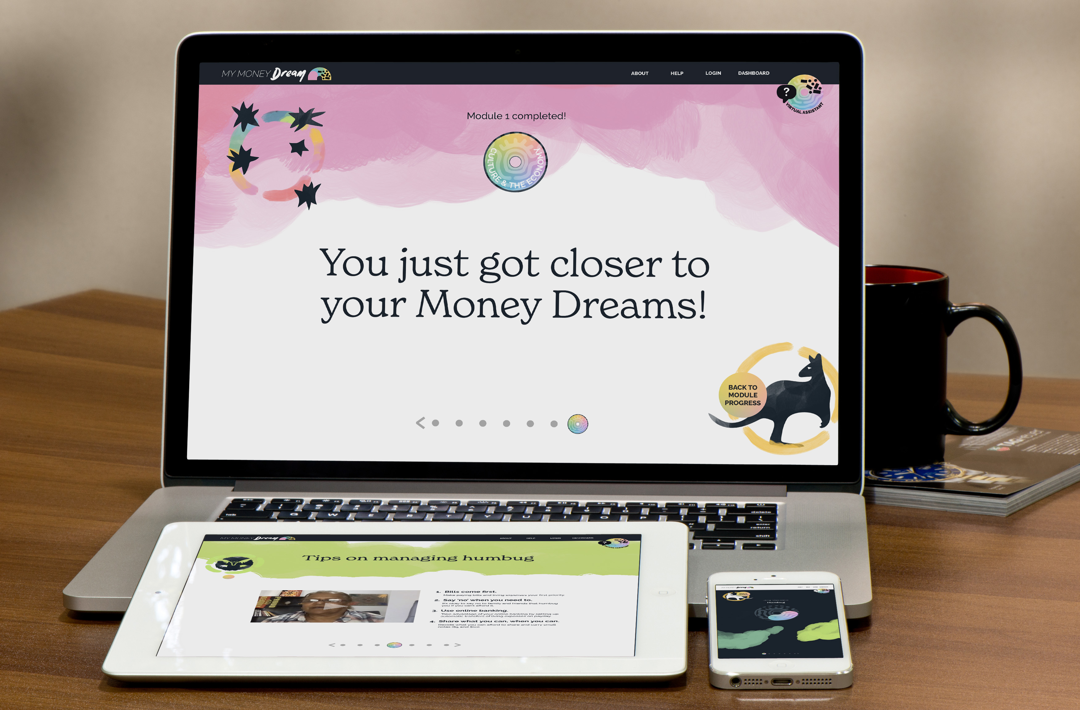
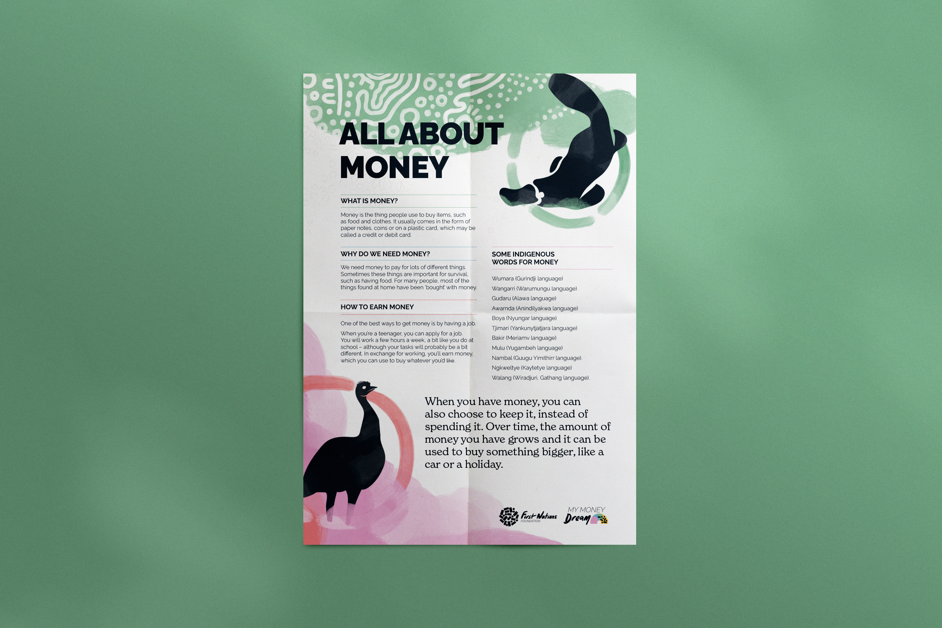
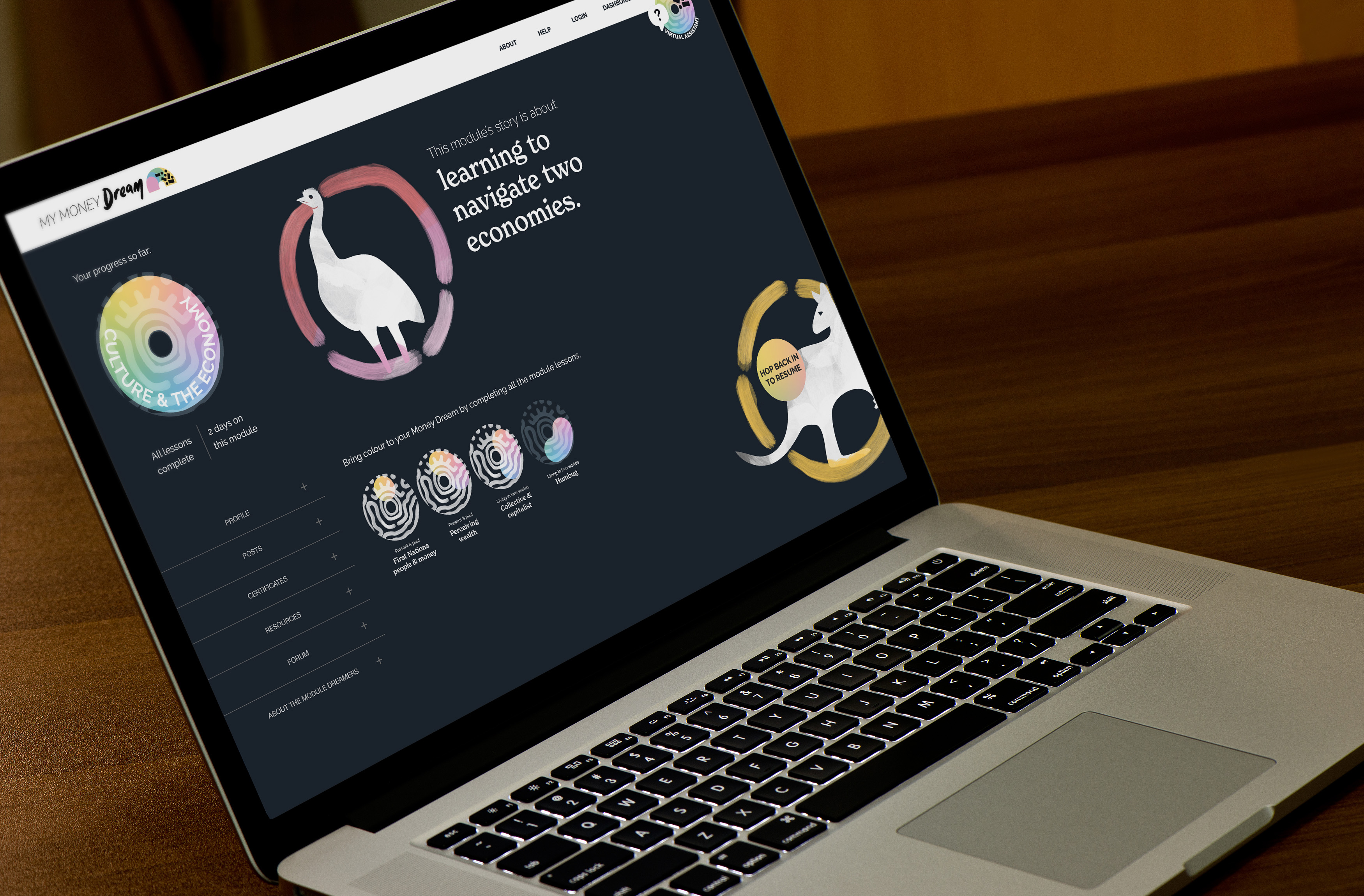
Our approach to the My Money Dream project was multidisciplinary and holistic. Firstly, we built on the workshop outcomes and previous work with FNF, to devise a strong brand identity that fit within the FNF brand family. With the aim of enlivening the My Money Dream learning platform content, we collaborated with Goreng Goreng artist Rachael Sarra who created a unique and meaningful piece of art for the project. We paired this artwork with a series of characters drawn from Australian bank notes (platypus, echidna, kangaroo and emu) to bring the modules to life in an engaging learning platform.
Secondly, drawing on our extensive experience and expertise in classroom and online education, we reviewed existing content and contributed new content to promote learning in an informative and story-telling style. In this work we drew on the new brand identity, artwork and characters to elevate the user learning journey through the module content. This included mapping out a user experience across the platform’s modules and lessons, and handing over for development.
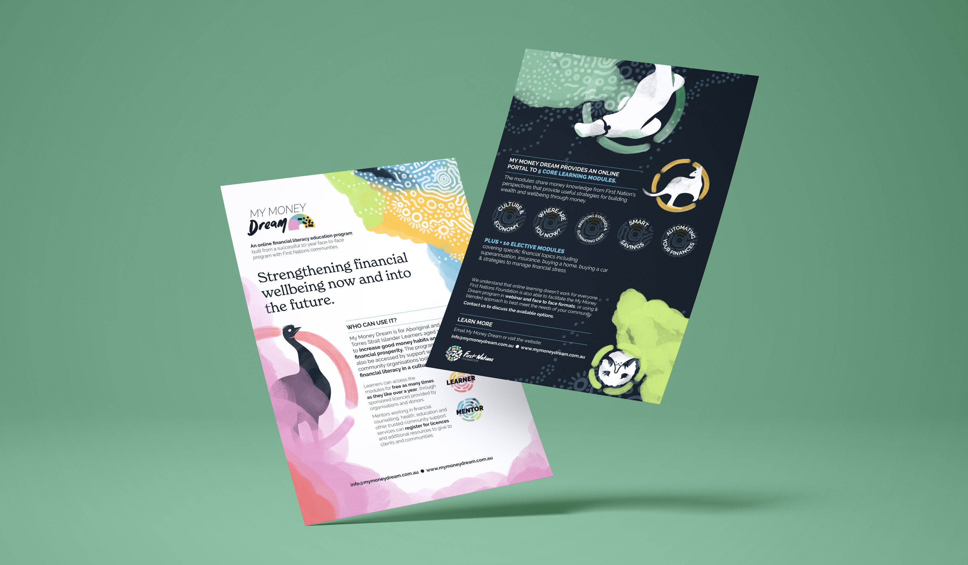
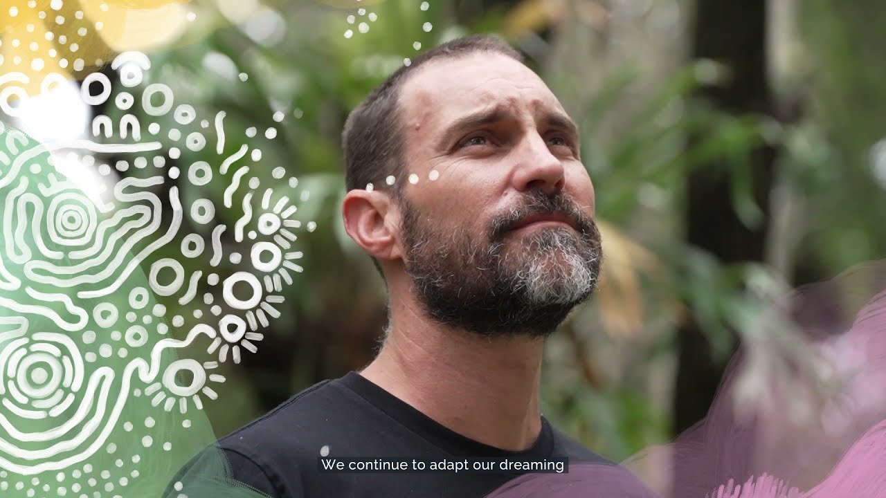
Lastly, we produced collateral to increase engagement with the platform. This included designing, scripting, producing and animating a teaser video with filmmaker Salvador Cantellano and developing a series of factsheets for use with various age groups, including school children.
