Embedding deep meanings of Country into the identity of an Australian landscape architecture festival.
Background
The Australian Institute of Landscape Architects (AILA) is a non profit professional institute and peak body for landscape architecture in Australia since 1966. AILA focus on quality public places, stronger communities, and environmental stewardship through ecological restoration.
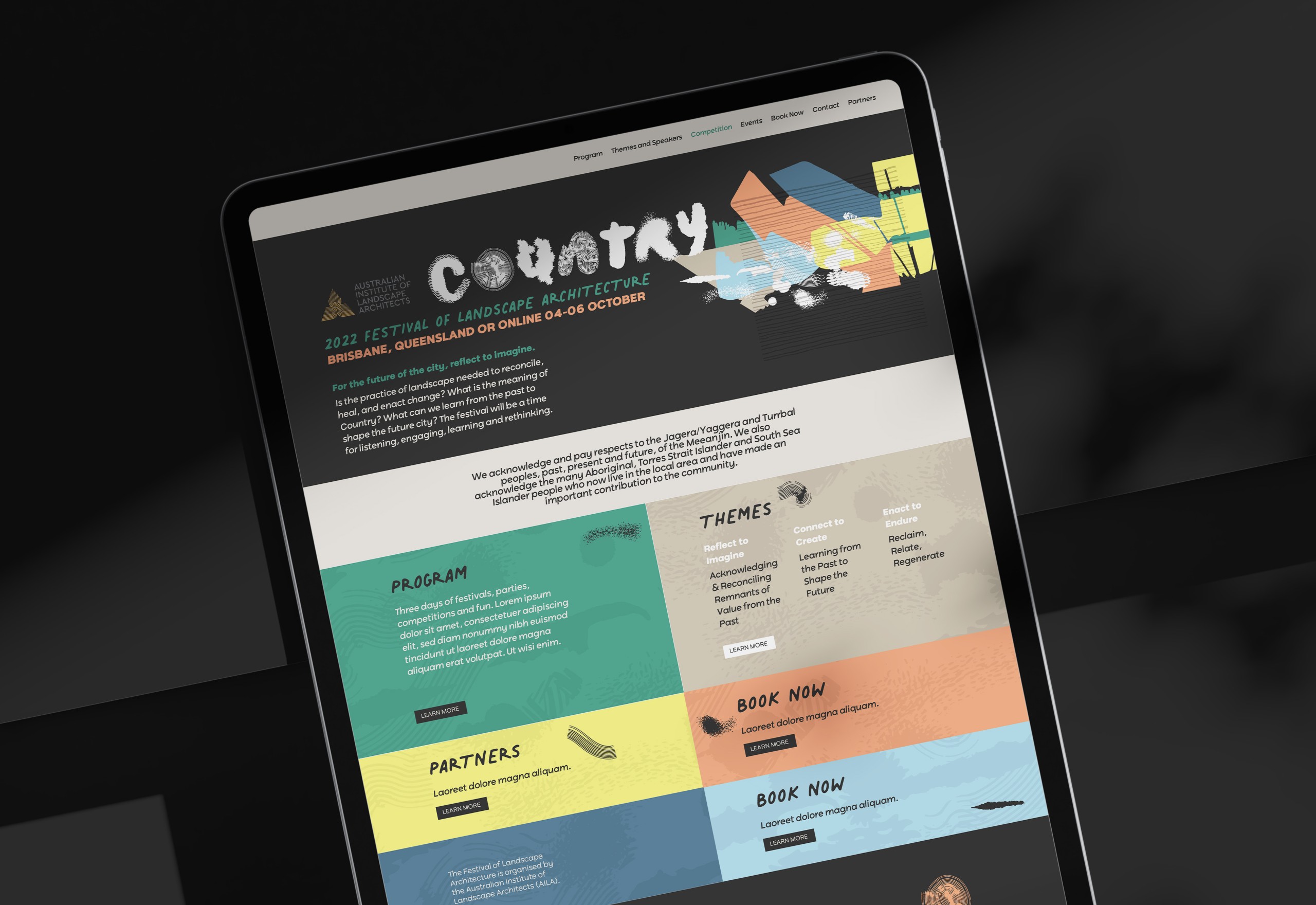
Since 2014, AILA have run the annual Festival of Landscape Architecture with a different theme each year. The festival will be held in Brisbane this October with the theme of ‘Country’, led by LatStudios, Blaklash Creative and Claudia Taborda as Creative Directors.
AILA and the festival’s Creative Directors engaged Relative Creative to develop the brand identity and visual collateral for this year’s ‘Country’ theme.
Specifically the theme asks:
For the future of the city, is the practice of landscape needed to reconcile, heal, and enact change? What is the meaning of COUNTRY? What can we learn from the past to shape the future city? The festival will be a time for listening, engaging, learning and rethinking.
Opportunity for futures
As a studio that passionately dabbles in landscape architecture in our own backyard, we saw the opportunity to enhance the meaning of Country as alive, active and full of diversity. The First Nations concept of Country extends beyond western values in land ownership, ‘use’ and economic productivity. Country encompasses people, animals, plants, elements, ancestry culture, language, stories and knowledge belonging to areas of land spanning the Australian continent.
Our approach
Relative Creative took a collaborative approach to the brand identity and associated visual collateral, in interactive presentations to AILA and the Creative Directors, while also drawing on Tristan’s illustration skills.
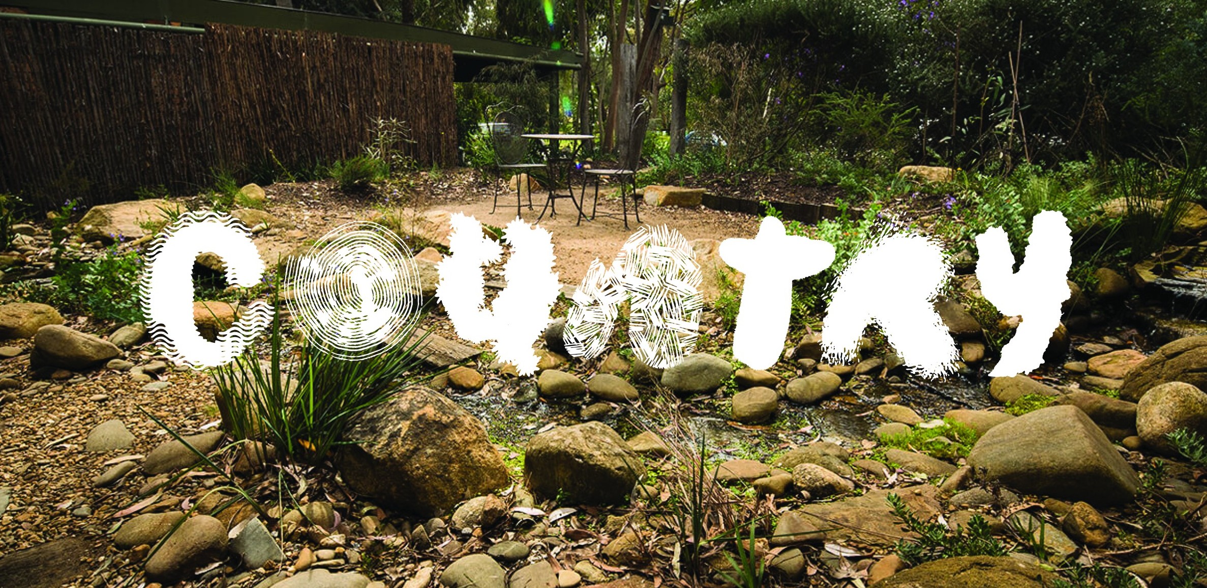
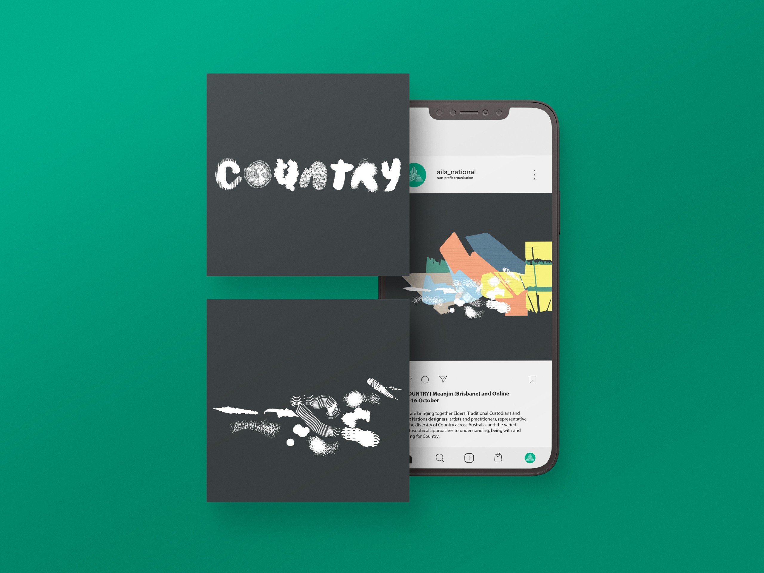
The ‘Country’ Festival of Landscape Architecture look and feel comprises of three key devices, deconstructed and assembled across the full identity that conveys a distinct story about the role of landscape architecture on Country.
It focuses on making plural notions of Country tacitly, and with tactility, present in the ‘Country mix-up letterforms’ of the main brandmark device. The seven different letterforms embrace difference, representative of the spectacular diversity in Country across Australia, and the tremendously diverse philosophical approaches to understanding being with, designing with and caring for Country, across the hundreds of First Nations geographies and peoples, and across the multitude of settler and migrated cultures and peoples calling Australia home, designing with and being on Country today.
The letterforms are juxtaposed with the brand’s secondary graphic devices. The ‘colour palette landscape’ is suggestive of landscape architecture in relation with Country; a transformed Country. It suggests that Country, and landscape architecture’s role in it, is fluid and in flux. The contemporary colours bring this open conversation into an inescapable dialogue with the fact that landscape architecture is, in its namesake, a human-transformation, or at least a curation, of a natural environment. Physical forms and lines of sight not seen on Country either dominate, vanish or rest in balance.
Thirdly, throughout the festival program the ‘Country winds of change’ graphic device appears. They float over the ‘colour palette landscape’, to suggest that no matter what conversations may occur, Country motifs from the letterforms steer and direct that debate. Designing with Country means allowing the typology of Country to reverberate with utterances of change. Country has shape, colour, pattern, sound, heart, spirit. The winds of change graphic element carry all this wherever they appear.
We are rolling out AILA’s ‘Country’ 2022 Festival of Landscape Architecture brand identity across the festival’s website, corporate collateral, pre-event marketing and event assets (e.g. slide templates, t-shirts and totes).
![]()